Can't you see this is you fate? This is 808State Debate - Cmon join us!
------------------------------------------------------------------------------------
What about 808State artwork??
The entire Don Solaris campaign is by far my favorite - the paper texture, the notes, the references, the sentences. I believe that's unanimous. Besides that, how do you feel about the design, the colours, the visual communication?
My other favorites are Forecast, the 88:98 campaign, 10 x 10.
808State Debate - v 4.0 - 808State Artwork
Moderators: Ancodia, markus, Pob, nickking
-
PeteZarustica
- Posts: 300
- Joined: 22 Apr 2002 01:00
- Location: Manchester
- Contact:
I really like the simplicity they have used up to Don S.
I think my faves are CubikOlympic, Plan 9 and Ex:El (CD version). But also Newbuild which is blinding! And a massive one as they released that record themselves. No art direction here.
10 x 10? I always had a problem with the white '10 x 10'. Was quite surprised that Farrow did that one.
I think my faves are CubikOlympic, Plan 9 and Ex:El (CD version). But also Newbuild which is blinding! And a massive one as they released that record themselves. No art direction here.
10 x 10? I always had a problem with the white '10 x 10'. Was quite surprised that Farrow did that one.
Last edited by solarex on 06 Dec 2005 15:18, edited 1 time in total.
Got to echo the Don Solaris sentiments, the artwork is great. Also love the Ex:el cover design and I really like the Optibuk cover design, modern and classy. The earlier sleeve designs (Cubik / In Yer Face) were simple but effective.
But the gong for the best piece of 808 artwork has to go to the legendary butterfly logo. Superb!!!
But the gong for the best piece of 808 artwork has to go to the legendary butterfly logo. Superb!!!
-
PeteZarustica
- Posts: 300
- Joined: 22 Apr 2002 01:00
- Location: Manchester
- Contact:
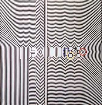
Newbuild is based on an old kodak film box ,I took that and the mexico olympics type to Johnson & Panas (MCR designers) and they put it together
Trevor Johnson had done a lot of stuff for factory, if it wasnt Peter Saville it was usualy J&P .They had done Compressor and Trouble Hand for Biting tongues so I was used to them..
Quadrastate they could nt do because the deadline was too tight , so a guy called Mick Peak did that (he worked in the same building) we kept the olympic font
Martin did let yourself go , just a sticker)(and Massagerama based on kinder eggs instructions
ZTT got involved ,Paul Morley was keen to be involved on ART and set us up with Mark Farrow (was he from MCR ? he used to come up for City Matches a lot) he did 90 based on a Purdys drink bottle (the fasionable ravers drink of the day) the fish is from an image library .(i never quite understood the fish but its a nice fish..I have the poster of that in my bathroom)
Trevor Johnson was back for EX EL ,i remember he sent the thing to be drawn on a computer which was well techno in those days, until then evrything was still razors and rulers ,set by hand ,letraset fonts etc,old school . we also used some video images which was still a bit of a fuss back then.
Gorgeous was Trevor based on our idea of an earth image..i origenaly wanted a very real earth image on a gold back ground,,but they would nt let us have gold (too expensive the ink not real gold)
but this is where the butterfly came in. the green and mustard was an odd choice on the sleeve.. forcast was based on the same artwork and was possably put up as an alternative for gorgeous sleeve.
timebomb .thats one i dont like that was trevor ,but again deadlines take over and sometimes you just got to roll with it.
i ll return with more later
-
PeteZarustica
- Posts: 300
- Joined: 22 Apr 2002 01:00
- Location: Manchester
- Contact:
Timebomb is ok, I just guess is a bit out of the context. I like Timebomb.
I thought Mark Farrow was from New Castle, I don't know why :|
His work with the lightning seed is great - too neat but great.
Some of the Johnson & Panas work can be found on the Cerysmatic Factory site - but I never saw anything really outstanding (especially from Saville's work) besides the 808State artwork (that I've just discovered who made now).
And what is it with 808 State and olympic games references?
Actually. I would say that this source is a very important thing in 808 State history. Along things with the TR-808 and Eastern Bloc.
Does anyone have pictures of inside Eastern Bloc? (Not the racks like the Q article) I've always had an imaginable picture in my mind of Martin behind the counter blabbing off to kids what's on and what's NOT.
yes i supose it keeps coming into it,
Plan 9 sleeve for instance
olympic the track (sleeve reminds me more of a beneton advert)
was actually composed as a theme for the Manchester olympic bid
so that is directly linked,
i guess if we want to go deep into therapy here i would say that having grown up in the 60s culture that my vision of futurism and 808state to my mind was about that , will always conect to things from my chilhood like olympic events in futuristic stadiums with emotive melodys (the Tokyo olympic theme comes to mind) BBC2 in colour for the 1st time showing expo 68 , along with more obvious spacerace stuff .but theres a language of graphics from the 60s that echoes in our Artwork during the early 90s
I think Don Solaris is when we drop that both graphicaly and musicaly..

Im trying to put some art up to do with that (how do I attatch pics here?)
Or markus can you do it of those i sent the other night ? when you get a mo)
Oh yes cant leave this subject with out mentioning the State to State artwork by Designers Republic..now they had their own thing going on usualy in microscopic type in silver on white..can any one read it? I like it
especialy with the envelope and stickers etc, theres a Don Sol sleeve done early on by them that didnt make it put i could dig that out too
anyone got the 808 Rizzlas from that launch?
Plan 9 sleeve for instance
olympic the track (sleeve reminds me more of a beneton advert)
was actually composed as a theme for the Manchester olympic bid
so that is directly linked,
i guess if we want to go deep into therapy here i would say that having grown up in the 60s culture that my vision of futurism and 808state to my mind was about that , will always conect to things from my chilhood like olympic events in futuristic stadiums with emotive melodys (the Tokyo olympic theme comes to mind) BBC2 in colour for the 1st time showing expo 68 , along with more obvious spacerace stuff .but theres a language of graphics from the 60s that echoes in our Artwork during the early 90s
I think Don Solaris is when we drop that both graphicaly and musicaly..
Im trying to put some art up to do with that (how do I attatch pics here?)
Or markus can you do it of those i sent the other night ? when you get a mo)
Oh yes cant leave this subject with out mentioning the State to State artwork by Designers Republic..now they had their own thing going on usualy in microscopic type in silver on white..can any one read it? I like it
especialy with the envelope and stickers etc, theres a Don Sol sleeve done early on by them that didnt make it put i could dig that out too
anyone got the 808 Rizzlas from that launch?
-
PeteZarustica
- Posts: 300
- Joined: 22 Apr 2002 01:00
- Location: Manchester
- Contact:
-
PeteZarustica
- Posts: 300
- Joined: 22 Apr 2002 01:00
- Location: Manchester
- Contact:
-
808state's Tartan Army
- Posts: 483
- Joined: 02 Apr 2002 01:00
- Location: Peebles, Scotland
- Contact:
Bits and pieces I must get around to scanning at some point -- Designers Republic did some one-off designs for State To State flyers. Various different colours. I'd love to see their proposed/unused Don Solaris sleeve.
Also ZTT placed scores of esoteric teaser ads, all with more of Paul Morley's "fig. 808" text, in Time Out across the months that Don Solaris was out. Great stuff. Great thread too -- enjoying this one!...
Also ZTT placed scores of esoteric teaser ads, all with more of Paul Morley's "fig. 808" text, in Time Out across the months that Don Solaris was out. Great stuff. Great thread too -- enjoying this one!...
Outpost Transmission early sleeve designs
Here are some Outpost Transmission sleeve designs that Graham mentioned:


